Overview
What started as a Lottie format exploration became a 350+ icon library.
It started as a creative exercise — designing and animating every icon myself to see how well motion could adapt across contexts. Once it worked, I published the set on IconScout so other designers could use it too.
I wanted every icon to stay lightweight, flexible, and easy to drop into a project without adding complexity for designers or developers.
The result is a library of 350+ animated icons, grouped into 8 categories and 2 styles. I designed the icons in Illustrator and Figma, animated them in After Effects, and exported everything with the Bodymovin plugin. Color customization built directly into IconScout means any icon can be tailored instantly to fit a project — turning the set into a flexible toolkit for motion-driven communication, not just a batch of icons.
Hover (on desktop) to see them move
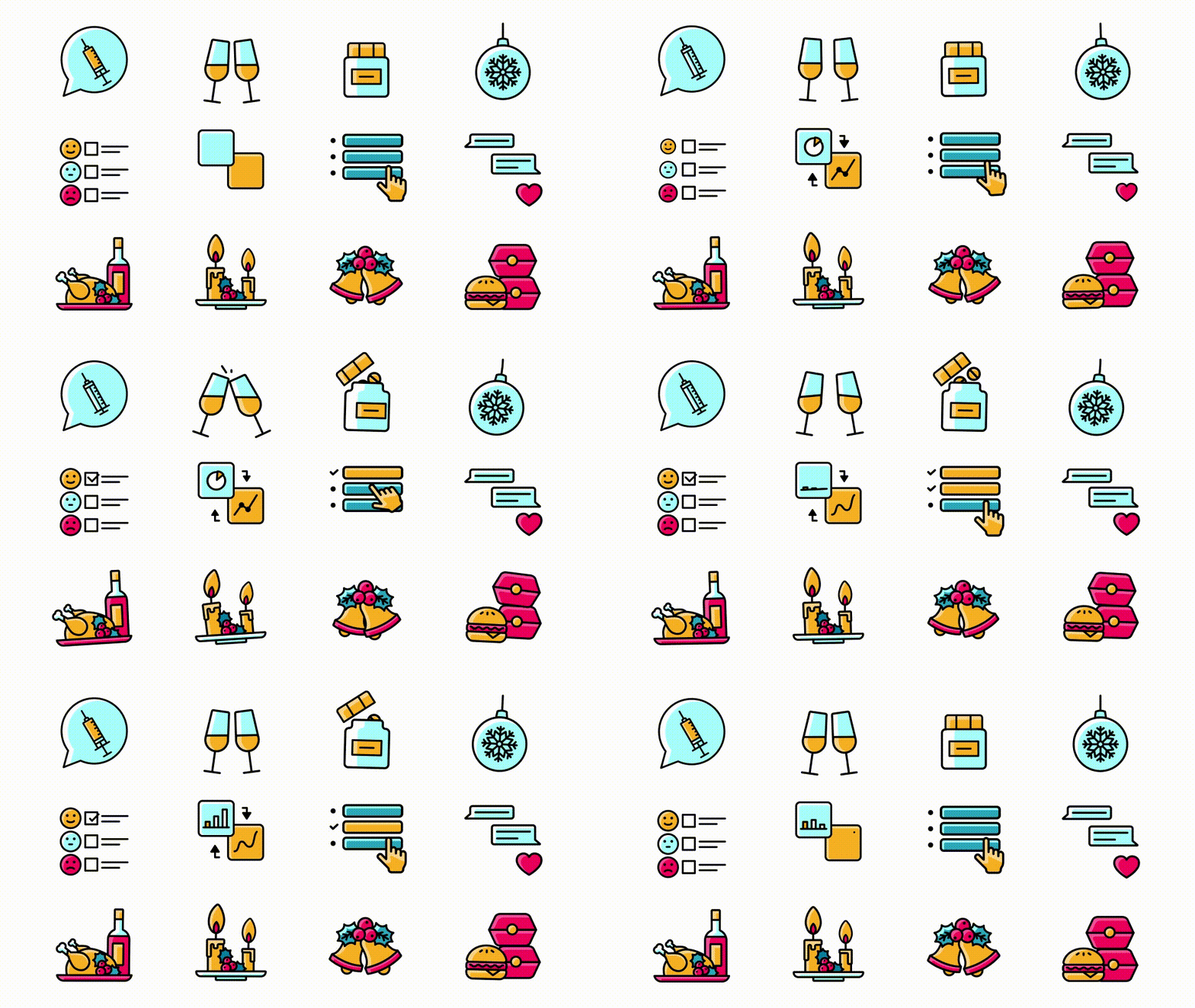
Browse, customize, and drop any icon straight into your project.
Styles & Colors
Every icon ships in two styles, and colors adjust directly in IconScout — no need to touch the animation file. Pick whichever style fits the brand, then tailor the palette in seconds.
The design specs every icon follows, keeping the set consistent at any size
The same icon in both styles: Flat Outline and Outline
Different palettes applied to the same icon, swapped live in IconScout
What I Took from It
Building this library taught me to design for reuse — icons that had to hold up across brands, sizes, and contexts, not just look good in one file.

